The data (not detrended) you asked me to look at is here:
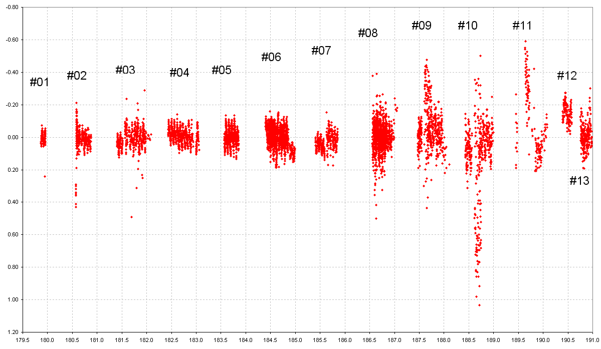
Figure 1. Data group number assignments. X-axis labels are JD - 2,453,000.
Folded Light Curves
All data analysis was performed using an Excell spreadsheet. Each data
group was processed in approximately the same manner. If a data group appeared
to consist of data having vastly different noise levels I processed the Quick
Look file to evaluate the noisiness of each observer's data separately. Only
the low noise data was retained for subsequent analysis. Here's an example
where Data Group #02 appeared to have vastly different quality data sets.
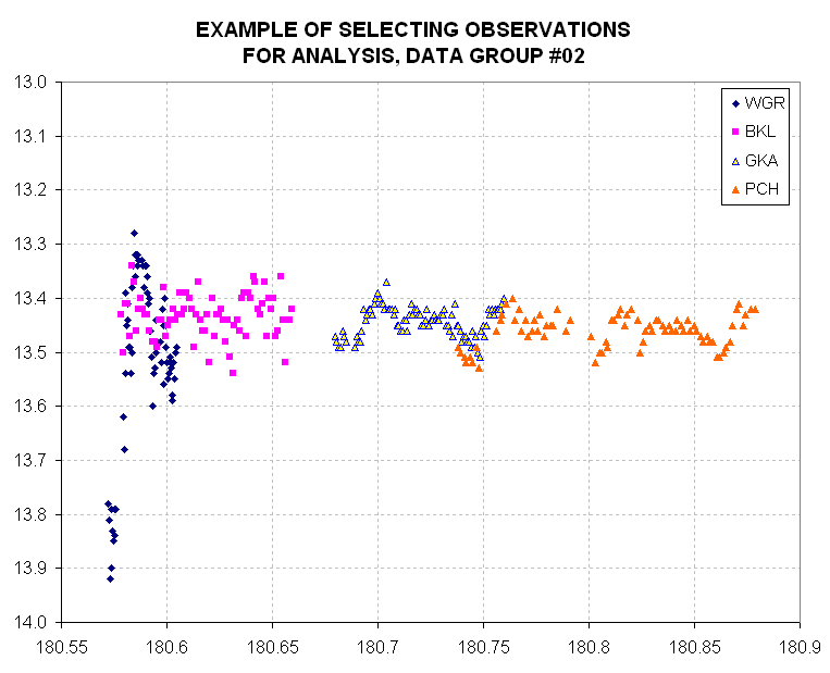
Figure 2. The first two data sets (WGR and BKL) appear to be
of lower quality than the second two data sets (GKA and PCH), illustrating
how the best data sets were selected for subsequent data group analysis.
(In presenting this figure I do not want to offend any observer, who
could have been trying his best under bad skies, or he might have been using
a small aperture, etc. In fact, it is possible that in this specific example
the star actually underwent a 0.5 magnitude fade at the beginning of the
plot, but there is a discrepancy between WGR and BKL at JD=180.6 which renders
the big fade at the beginning unlikely.)
After selecting the best observer data sets for a data group I removed
temporal trends if they existed. Offsets were forced equal to zero.
An approximate "phase" for each observation was calculated using the JD time
tag and a simple equation (that made use of the MOD(x,1) function). A graphical
display of magnitude difference versus phase was displayed. By varying the
assumed period it was possible to determine an approxiamte period solution.
For the first data group and a couple others I performed an objective period
solution by a multi-step process: 1) sort the data by phase, 2) construct
a sliding boxcar average, 3) calculate the RMS difference of individual magnitude
differences from the average trace, 4) adjust the period and repeat the previous
steps. A plot of RMS versus period was used to chose a period solution. Data
that were obviously "outliers" when viewing the folded phase plot were deleted,
and if necessary the above procedure was repeated.
A phase offset adjustment was then performed so that the brightest "peak"
occurred at about 50% phase and the faintest "valley" occurred at about 20%
phase. The folded light curve shape changed for each data group so sometimes
I had to guess when a competing peak was to be identified with the "main
peak" and similarly for the deepest valley. As the next figure illustrates
the main peak and valley features were not always 30% of phase apart, and
this required that a compromise phase offset be chosen.
Now I'll show each data group's folded light curve.
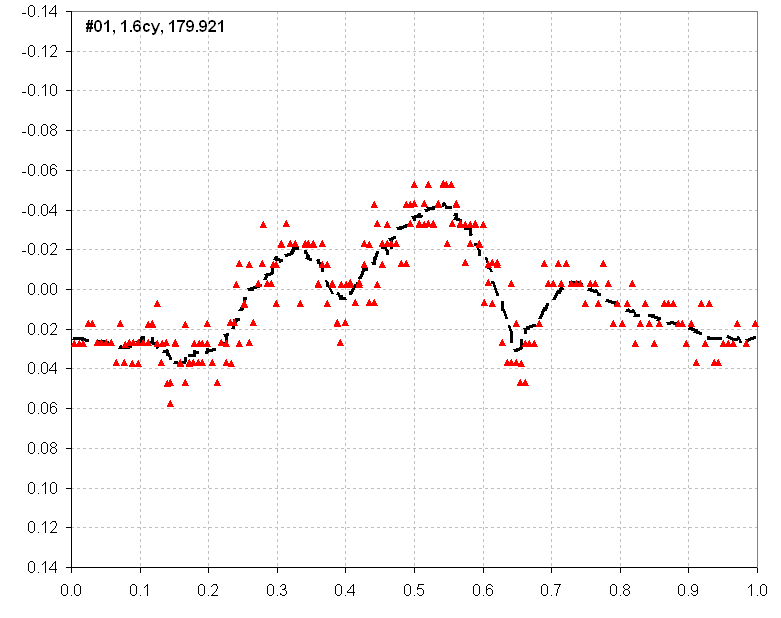
Figure 2. Folded light curve for Data Group #01. About 1.6 cycles
of data have been folded, using a period of 0.0577 day (an eyeball best
fit period). Zero phase occurs at JD - 2,453,000 = 179.921 (as shown by
the label box in the figure). The dashed trace is a sliding boxcar average.
Outlier data (subjectively determined) have been deleted from this analysis.
In this figure there is one main bright peak at ~53% phase, and a faintest
minimum at ~15% phase (with a competing faint minimum at ~65%) This is a
3-peak light curve, and since the relative brightness of each peak varies
with date the three peaks are sometimes evident and at other times they aren't.
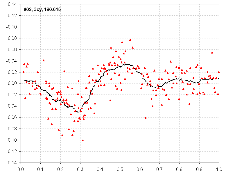
Figure 3. Folded light curve for Data Group #02.
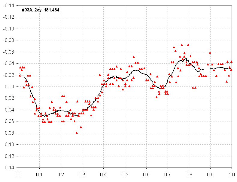
Figure 4. Folded light curve for Data Group #03A.
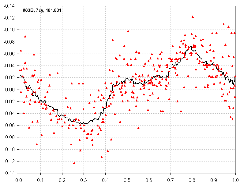
Figure 5. Folded light curve for Data Group #03B.
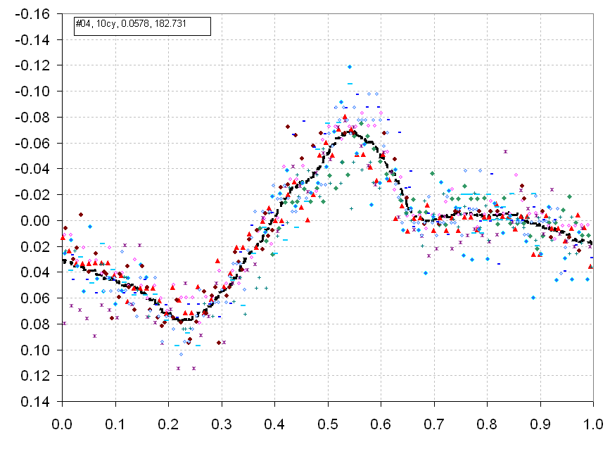
Figure 6. Folded light curve for Data Group #04. The 10 cycles
of data for this group allowed a good "period" solution, 0.0578 days.
An additional fading trend was removed from this long data set, corresponding
to 0.065 magnitude/day.
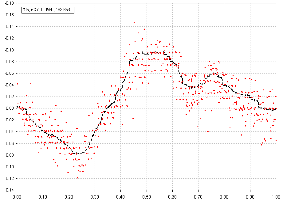
Figure 6. Folded light curve for Data Group #05
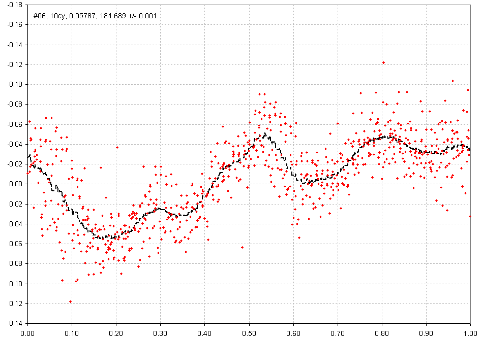
Figure 7. Folded light curve for Data Group #06. (Extensive editing and slope removal required)
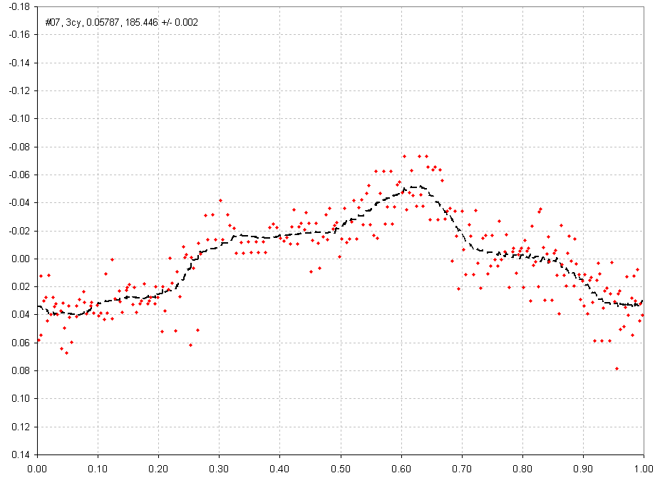
Figure 8. Folded light curve for Data Group #07 (rejecting noisy
data)
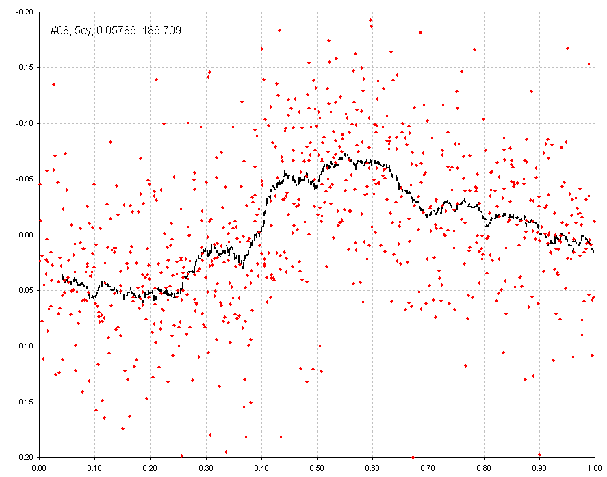
Figure 9. Folded light curve for Data Group #08 (rejecting noisy data)
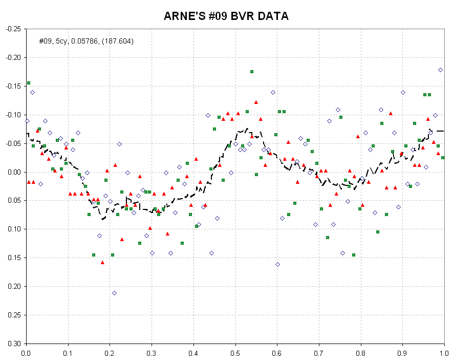
Figure 10. Folded light curve for Data Group #09, using only Arne Henden (HQA) BVR data.
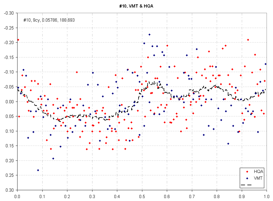
Figure 11. Folded light curve for Data Group #10, using inly VMT and HQA data.
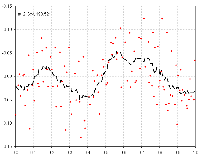
Figure 12. Folded light curve for Data Group #10, using inly
VMT and HQA data
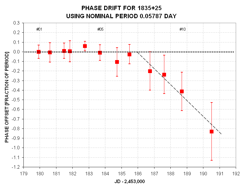
Figure x. With an adopted period of 0.05787 day it is possible
to compare the individual data group "phase offset parameter" with a predicted
value (based on the adopted period and an easily determined number of
cyles between data groups). SE ranges are shown for each data group phase
solution. At about 186.0 the period appears to have chagned to 0.0574
day.
Note that "JD" = 186 occurs between Data Groups #07 and #08, which is
when the object begins its rapid fade - as shown on the next figure.
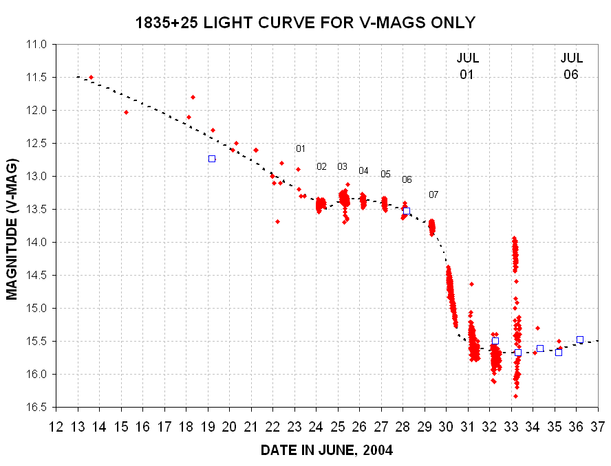
Figure x. Light curve with Phase Shift Data Group numbers indicated.
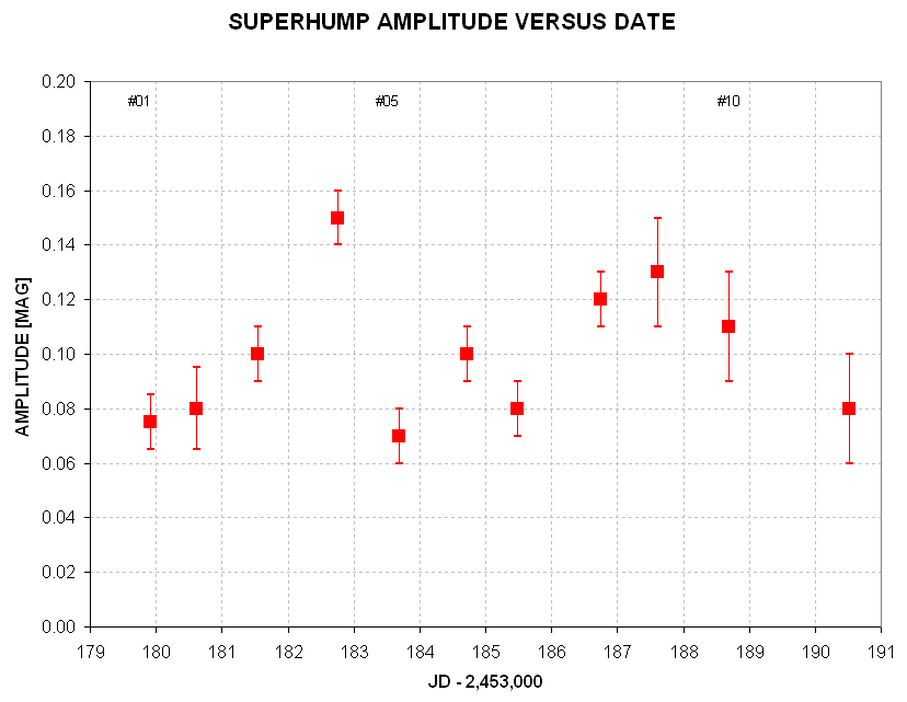
Figure x. Amplitude (peak-to-peak) versus date for the superhum
shapes.
There appear to be real variations of superhump amplitude with date. The
impression one gets in comparing shapes from neighboring data groups is
that several components come and go, or maybe move in phase with respect
to the principal components, causing reinforcement or subtraction of brightness
of the several components involved. For this I conjure up a mental
picture of an accretion disk that is wide, with a nonuniform distribution
of material versus longitude at each annulus. If the different annuli of
the accretion disk have clumps of radiating material that are rotating with
different periods, then the various clumps of radiating material will be
"in phase" with others sometimes and not in phase at other times. If any
of the clumps fades there would be a change in shape and possibly a change
in period. The way I determined phase offsets is more dependent upon the
seemingly persistent faint feature (that I've placed at phase ~0.25) and
a bright feature (that I've placed at phase ~55%). Sometimes these two features
are separated by diferrent phase amounts, and when this happened I used an
average phase. This procedure is subjective, and it represents a limitation
of the meaning of the phase drift plot.
If we were to discover that real phase wander existed then I would speculate that the accretion disk is an annulus of wide extent, and the particles in each annular ring are pulled by slightly different forces because of their different distances to the accreting star. Clumping may be present, the rotation period of each clump may be different, the precession behaviors of each annulus may be different. If the accreting star has a strong magnetic field it will tend to "capture" the ionized particles (probably just protons and electrons) and force them to revolve with a period that is slightly longer than the accreting star's rotation period (I think). The stronger the magnetic field, the closer the various annulus periods are to the accreting star's rotation period.
Analysis of Data Group #11 is next.
____________________________________________________________________
This site opened: July 11, 2004. Last Update: July 15,
2004