Lamenting the Demise of P.E.
"A measurment isn't a measurement until it's assigned an error."
Bruce L. Gary
Once upon a time, I suppose it was in the Good Old Days - though in the Early Sixties we wouldn't have called it that, since there were no worries about the future, and we had no concept of it - we made measurements, analyzed them, averaged them, and assigned probable errors, PE, to the averages.
The PE had two great advantages: 1) the very words conveyed to the reader the need to be mindful that the data are inherently uncertain, and even the averages have a probability of being in error and missing Truth, and 2) any model line fitted to the data with their PE bars should miss about half the bars.
This last point is important, since PE bars afford the best opportuity for the reader to subject the model fit to the error bar test. To understand this, consider the case of having 10 bins for averaging data, and each average has an associated PE bar. Statistically, the model should miss 5 bars. Now, consider the use of the standard error, SE. An SE is 1.483 times larger than the corresponding PE, and it should contain 68% of the probability of the actual, true value being within the SE bar - not the 50% for the PE bar. Hence, for 10 averaging bins, we should expect the model to miss only 3 SE bars. By choosing to use SE instead of PE, the reader is given only 3 opportunities for doing the model/data reality check, whereas there would have been 5 opportunities if PE had been used.
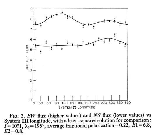
Figure 1. Example of use of PE bars on data bin averages. Note how about half the bars miss the model fit, which is expected if the PE calculation was correct and if the model fit is not over- or under-parameterized. From Bruce Gary, 1963, "An Investigation of Jupiter's 1400 Mc/s Radiation," Astronomical Journal, 1963 October.
Everything was humming along just fine, with everybody using PE, until one day a sloppy experimentalist had problem with his data. He didn't know it, but he had "calibration systematics" that were large in relation to the stochastic noise level of his measurements. His model tracemissed most of the PE error bars, yet he believed his model was OK. He didn't know how to deal with calibration systematics, or he might not have known about them. He didn't have the opportunity to return to the field to re-measure things, yet felt the pressure to publish. What could he do? His problem was that PE bars weren't long enough. Ah ha! Use SE bars! They're 48% longer than PE bars! He did it, in desperation, and it worked. Being unaccustomed to seeing SE bars, his readership merely looked at the approximately "good fit" of model trace with error bars, and pronounced the work a success.
Devious minds work alike, and soon more and more papers began to appear using SE. When pressed for an explanation and defence of the use of SE instead of PE, some clever authors answered that they were just trying to be conservative, didn't want to over-sell the power of their data, and were merely helping the reader avoid over-interpretations. This sounded good, as it made the author appear cautious instead of manipulative, or lazy for not finding the calibration systematics in the data or for developing a better model. PE's had disappeared forever - or so it seemed.
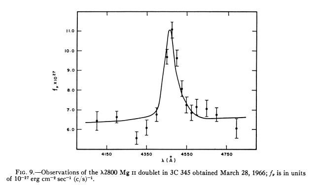
Figure 2. Example of using SE. Note that 10 of 15, or close to the expected 68%, of the SE bars intersect the model trace. Stated another way, 5 SE bars clearly miss the model trace, which is close to the expected 32% miss rate if the model is OK and the errors are free of calibration systematics. This is a proper use of SE's, as the author is not trying to cover-up an inadequate model by adopting SE's instead of PE's. From E. Joseph Wampler, "Scanner Observations of Four Quasi-stellar Radio Sources," Astrophysical Journal, 147, 1, January, 1967.
Over time, the scientific readership became lulled into accepting the use of SE's, and their 68% expected intersection rate with model traces. Few understood statistics well enough to realize that they had lost the PE advantage of having the maximum number of expected "misses" with which to quicklly make visual reality assessments of the match between data and model. For example, in Fig. 2, there are 15 poitns with SE bars, and 5 are clear misses. That's close enough to the expected 4.8 (32% of 15), so it passes the quick reality check. But it would be better if PE's had been used, for then we would have had an expected 7.5 "misses" to count, and our reality check assessment would have been more robust. This is what was lost by going to SE's.
The story continues, for experimentalists continued to occasionally encounter calibration systematics, or defective models were occasionally used to explain measurments. The strategem of replacing PE with SE, originally instigated by sloppy experimentalists, lost its power to hide their faulty models and poorly calibrated meaurements when readers became accustomed to seeing 68% of model fit lines intersecting error bars. Gradually, sloppy experimentalists were presented with the same old challenge: what do you do when you've got a problem with systematics in your data, or an inadequate model? Answer: Use a multiple of the SE, such as 1.645 x SE, which corresponds to 90% confidence limits. In doing this, of course, it will be prudent to not state that the error bars are bigger than SE; rather, the author should merely state that the error bars correspond to 90% confidence limits. The right brain will be fooled, while the left brain can plead innocent.
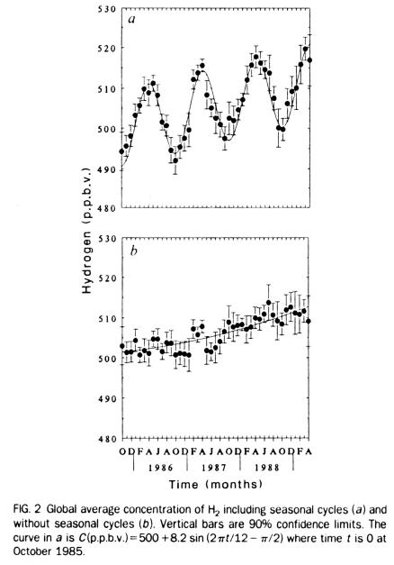
Figure 3. Plot of hydrogen versus year, with error bars that are 1.645 times SE, yielding 90% confidence limits. From Khalil and Rasmussen, "Global Increase of Atmopsheric Molecular Hydrogen," Nature, 347, p. 743, 25 October 1990.
In Fig. 3's lower panel there are 43 data average points, and only 3 aren't intersected by the model fit line. Given that the error bars represent 90% confidence limts, we should expect about 4 intersection misses - so the plot passes the reality check. But notice how the reader could make a more robust assessment of compatibility if the error bars were PE and 21 points were expecetd to miss the model line.
An bolder alternative is to use twice the SE as a bar, thus assuring that many more of the bars intersect the model. In defence of this practice it was said that the 2 x SE bar guided the reader in knowing where the 95% confidence level extended. This was supposed to be "helpful" to the reader, but we all know who it really helped.
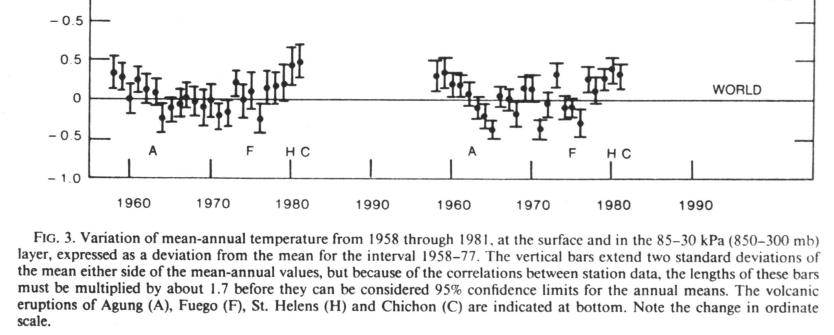
Figure 4. Portion of global temperature data, plotted with
"two standard deviations" error bars. From Angell and Korshover, "Global
Temperature Variations in the Troposphere and Stratosphere, 1958 - 1982,"
Monthly Weather Review, 111, p. 901, May 1983.
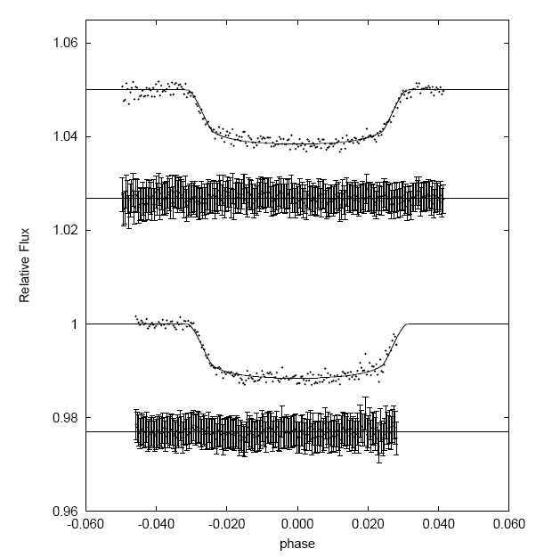
Figure 5. "Light curve" plot for a transiting exoplanet on two
dates. Below each light curve is a "difference" plot (also called "O-C") meant
to illustrate that residuals do not exhibit systematic variations.
My first reaction to this plot was to laugh out loud! The plot of residuals
have error bars that obscure the points they're attached to. But worse, the
error bars are much, much greater than SE per data point, as anyone can see
by visual inspection. Recall that for SE error bars approximately 68% of them
should intersect a model (assuming the model is a fair representation of
the data). In this case ~99.5% of the error bars intersect the model, which
is what would happen if ~ 3 x SE were employed. It would have been better
to merely plot the residuals as points and omit the error bars.
Now, recall that SE is calculated by first computing the population standard deviation, SD; then dividing by SQRT(N-d), where "N" is the number of data points in the averaging bin and "d" is the number of degrees of freedom associated with that bin (which is "one" for simple examples). By dividing SD by SQRT(N-d), the value for SE is obtained. When N is large, the difference between SE and SD is large.
Imagine the temptation when a model is really not up to the task of explaining a data set, and the 2xSE bars still provide too narrow a path for the flawed model to make the required number of "intersections." What is a scientist to do in that situation? Three responses are possible: 1) review the measurements to assure that calibration systematics have been properly evlauated, 2) improve the model so it fits the data, or 3) play more games with the error bars. The 2-sigma solution was only good for marginally bad models. Some situations call for a more drastic response. That when a really creative person came up with the most devious of plans. His reasoning could have gone like this: "Didn't someone, in the past, get by with a substitution of SE for PE, and slide through the day without working hard? Then people started replacing SE with 2 x SE, and that worked, didn't it? So when the going gets really tough, why not use SD instead of SE! When the number of data points is large, the payoff as measured by "error bars intersecting model lines" will also be big. Thus was born the new trend of substituting SD for SE when drawing bars on average data points.
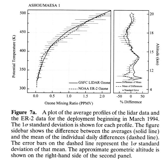
Figure 6. Comparison of ozone mixing ratio using lidar and ER-2 in situ measurements (left panel). The comparison looks good, based on the overlap of error bars. The "error bars" it turns out, are really population standard deviations, referred to in the caption by the ambiguous term "1-sigma standard deviation of [the] mean." I think they meant "1-sigma standard deviation from the mean," which is equivalent to population standard deviation. From McGee et al, "Vertical Profile Measurements of Ozone at Lander, New Zealand During ASHOE/MAESA," J. Geophys. Res., 102, p. 13283, June 20, 1997.
When the first graph appeared with averaged data points having SD bars, I imagine that someone questioned the author about it, and he replied "But I don't want to over-sell the power of my data; I'm just being conservative."
To be fair, which I hate to do, there are occasions when SD bars are appropriate. If the thing being measured varies over time, such as seasonally, then the SD bars give some sense of how important this real variation could be in hampering the experimenter's attempt to average the vatiation out for the purpose of evaluating, for example, a secular trend. The use of SD in Fig. 6 might possibly be justified on this basis, though the text does not explicitly state that.
After some years of this, when everyone becomes accustomed to seeing SD bars going through symbols for averaged data, the readership will begin to expect to see model fits going throuigh ALL the SD bars, affording no opportunities for reality checking. Everyone will be happy. The author will happy, because it will look like his model is compatible with the data. And the readers will be happy because it will look like they are seeing progress in their field, since models appear to be fitting new measurements. Everybody's right brains will be happy, but there will be disquiet within the left brains.
There are times when a left brain should stay quiet. In settings where being wrong has career consequences, it is prudent to appear cautious, and making your data say less than it really is capable of saying is a sign of caution. Why risk one's career using PE's when SE's and SD's will provide extra layers of protection? And today, this is where most scientists are at. They calculate the average of data within a bin, calculate the population SD, and instead of dividing by SQRT(N-d) and multiplying by 0.677 to get PE, they use the population SD value to create an error bar for the data bin average. Very misleading, quite useless, yet a coming fashion!
Is any further degradation possible? Yes, I have detected a new trend! It's to simply not average data, and instead plot every raw data point. For short integrations, the scatter can be immense. The noise can be so overwhelming that any signal can remain buried. This may be the ultimate in data cowardice! It affords a maximum of protection from accusation of data manipulation, and presents the impression that the author is hiding no blemish from the reader. The data has the feel of having never been touched, and in a sense this is a fair impression. If the data has something to say, it surely is handicapped in conveying its message by not being averaged.
I will not present an example of this, as I have only detected the inclination for it in only one investigator, and it would be unkind to feature him (yes, it's a him) here.
The only good thing I have to say about data presented in its raw, pure, unaveraged form, is that it is at last free of the oxymoronish SD "error" bars. Maybe it is worth promoting the trend of presenting raw data, even thoguh the reader is subjected to a million points spread across the page that buries the feeble message within. This may be a good idea, because it will hasten the day when, in exasperation, someone will create a theory for averaging data. And there's a chance, a slim chance, that the brave person to introduce data averaging will adopt the concept of PE, and boldly proclaim that his data averages are "probably in error" by the amounts shown by the PE bar lengths. This will sound good, and it may catch-on.
Nietzsche believed in eternal recurrences. There may be some truth in this idea. Trends tend to "play themselves out," and when they reach an end point that exhausts all merit in the fated fashion trend, the time becomes ripe for a bold new start. With luck, the new start will have merit. But in the big picture scheme of things, every component part of a cycle is short-lived. All good things get replaced - as do all bad things. The only constant is change.
This site opened: 1999.09.22. Last Update: 2008.12.18